This post is sponsored by Twenty & Oak. All opinions are 100% my own.
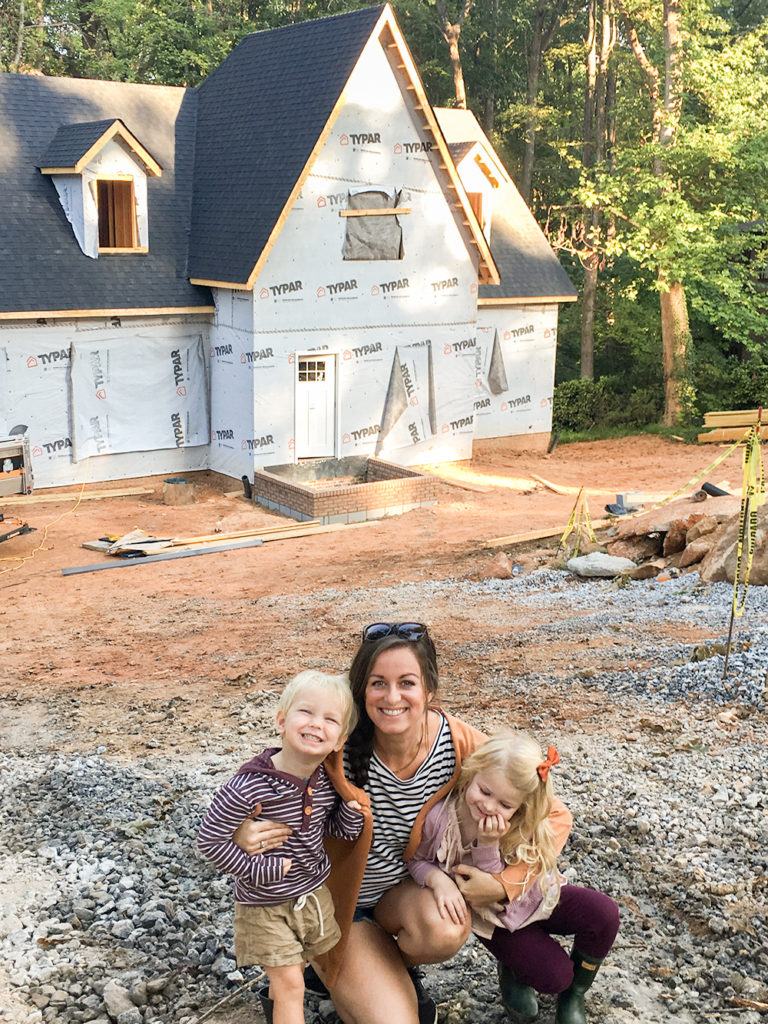
Designing The Buffalo Burrow has felt like the sweetest piece of our journey yet. I don’t want to say the end because our adventure will always be unfolding, but it does feel like a culmination of where we’ve been so far. I’ve taken all that we’ve learned from our past four renovations and house designs and have poured them into this haven for us. And I’ve got to say, I’m more proud and excited about this design than anything I’ve ever created.
Today, I’m thrilled to give you guys the first look at the Burrow design vision. I shared our initial inspiration to build a new house that felt like an old, European country house on a budget. What a challenge, right? But today, I’m going to start breaking down how we’re tackling that with our COHESIVE HOUSE DESIGN PLAN complete with a video at the end.
This is always my favorite post when we start a new house because all other spaces flow out of it. With each project we’ve tackled, I come up with an overall design plan (color palette, general feel, etc.) first and then I design each room out of it so that the home flows and feels cohesive. Who is ready to see where our beloved Burrow is headed?
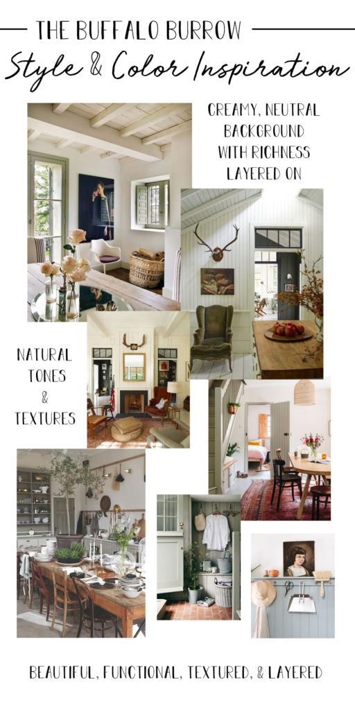
I keep chanting CREAMY & RICH, CREAMY & RICH, CREAMY & RICH to myself because that truly sums up what I’ve been drawn to. Creamy backdrops where the furnishings and details layered on top can be rich anchors for the space. One area that I’m giving more thought to than I have in previous projects are the floors.
While I’ve loved every project we’ve done, I’ve never thought about the floors up front. They’ve always been an afterthought and that’s made them a design challenge later on. For this project, the floors were actually the first thing I thought of!
I knew that light walls in most spaces would be a given. I love them and always will love their classic backdrop that allows you to go any direction with the rest of the rooms. Plus, that’s a great way to make a home feel cohesive. Beyond that, the first thing I noticed when looking at inspiration was how much I was drawn to light, wide-planked floors in all of the old homes I was pinning. I absolutely loved how it paired with the creamy white walls and created a beautiful light backdrop.
I was so excited to find the brand Twenty & Oak as I started hunting for flooring. They are an online platform featuring stylish, high-quality flooring in a ton of categories: hardwood, laminate, waterproof flooring, engineered stone, and luxury vinyl plank. I started browsing by flooring type and that let me to Veranda by Palmetto Road’s Charleston Collection.
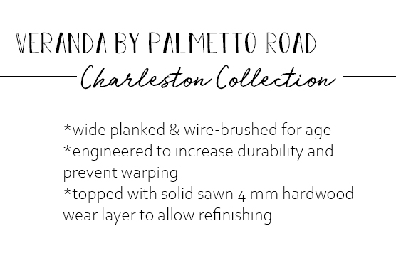
While we have loved our solid hardwoods in each house, we have often had issues with warping in our humid Southern climate. We liked the selling points of engineered wood floors, but with active toddlers and a 125 lb. Great Dane, we felt we needed the option of future re-finishing. We were searching for the look we wanted, but in a durable kid-friendly and pet-friendly finish. Enter the Charleston collection! It is designed to be an heirloom piece in your home that will be enjoyed by generations. It’s extremely durable and has a 50-year warranty, which blew us away! With the quality of the floors, we shouldn’t need to refinish them, though we liked that there is that option.
I really wanted the look of age: wide plank and some texture or wire-brushing to the boards. But so often, I’ve seen floors with that technique and it looked like a repetitive pattern and fairly fake. What I learned as I explored this collection is that’s because the treatment is usually done by a machine, so there IS a pattern to it. These floors are wire-brushed 100% by hand, so the technique truly mimics the randomness of aging.
I explored the Twenty & Oak site, checking out all of the colors and then ordered some samples to see in person. Twenty & Oak will send you three samples for free and each additional sample is $5 after that (but they’re offering six free samples for White Buffalo readers – details at the bottom of the post!) I knew I was going for lighter floors in this house, so while they have some gorgeous dark options, I ordered mainly light choices to check out.
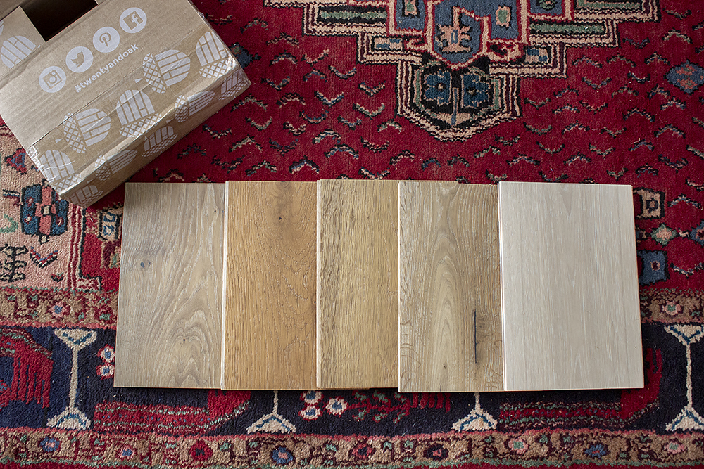
When they came and I opened up my box, I was so excited. The quality was amazing. I loved the wider plank that immediately feels more historic. And I also loved the different finishes and textures. All of the colors were gorgeous, but we were quickly drawn to two in particular: COTTONFIELD & SWEETGRASS (the two on the right above).
I loved their lighter colors and the dimension they each had. And I knew the tones of them would pair so well with the rest of the design vision that has been taking shape in my mind. I was hoping to go less honey, but not gray in tones and these two were right in there! Now, who is ready to see the complete, whole house design plan and how these floors fit in? I wish I could enter a dancing emoji or something here because I am THAT excited, friends. Here she is!
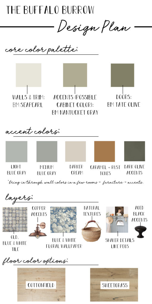
I have to say, I am in love. We’re going with creamy white walls throughout the house. We’re pretty sure we’re going with Benjamin Moore Seapearl, which definitely reads as white, but is creamier than what we’ve used in the past. It feels older to me, plus I like the creamy tones with the woods around us. There will be a few colored rooms painted some of the accent colors above, but for the most part, it will be all cream.
Then, we’re pulling from the nature outside our windows with a lot of sages, olives, and blue/grays. There will be darker shades of olive, rust tones, and bits of black for contrast. And so many nature-inspired and classic details layered on. I love colored doors with creamy-white walls, so that will be making an appearance in this house as it has in our last two houses. We’re going with a neutral-ish shade of darker olive for doors. It’s a mid-tone so not too dark, but a definite contrast with all of the lighter colors.
And now that the vision is cast, let’s take a look at both of these floor colors up close with some of the tones we’re looking at.
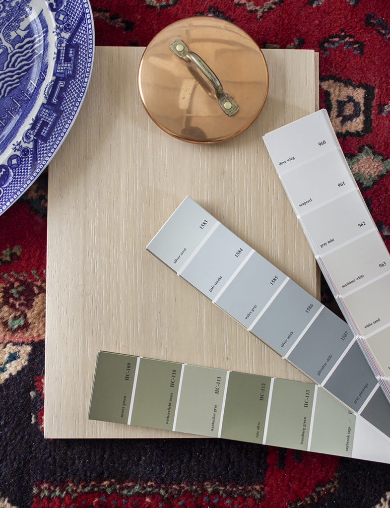
I love how this floor really captures the lighter, almost white-washed look I was inspired by and that paired with the light walls, gives me that creamy backdrop I was hoping for. I also love that it allows me to go as dark as I want with accent colors for contrast.
While Sweetgrass isn’t a dark floor, you can see that the darker tones give the rest of the design a completely different feel. These darker floors would cause me to go slightly lighter with accent colors so that the space doesn’t get too heavy.
Chris and I like both of these, but we each have a favorite right now. And of course, those favorites are opposite. Our next step is to head into our local retailer to see larger samples in person, so that we can make our official decision. What I loved most about Twenty & Oak is that they’re connected with the best flooring retailers in the Southeast who have resident experts to answer all of your questions and point you in the right direction. You can also see larger samples and coordinate install there. Plus, you can bring the larger samples home, so you can see them in all different light (it’s especially important to see them in the space they’ll be installed in, if you can). Make sure you check out the Dealer Locator feature on their website to find the dealer nearest you.
I put together a video with my tips for creating a cohesive house design plan where I also talk in more detail about these design choices for The Buffalo Burrow! And in it, I share the very first image that inspired this entire color palette and vision…every image I found after that just confirmed it. Check it out below:
A huge thanks to Twenty & Oak for partnering with us on the floors! I cannot wait to see this vision come to life. Twenty & Oak is offering six free samples to White Buffalo readers (instead of their usual three) when you use code BUFFALO! So head over and check out their awesome flooring options. They’re available at retailers throughout the Southeast.
Also, Twenty & Oak also offers a coupon for $100 off your flooring purchase of $1500 or more. Create an account and your special coupon code will be sent in your welcome email. You can redeem it at the point of purchase from your Twenty & Oak dealer.
Y’all, it’s cracking me up how excited I am about these floors! I’ve gone from the floors being a complete afterthought when designing a space to them being what I’m most excited to see installed! Now to actually pick one…which one do you guys love with the design? Cottonfield or Sweetgrass?

Lindsay, I have to say I’m so excited for ya’ll. I love the colors you’ve picked and the flooring. My favorite is the Sweetgrass because of the way your other colors pop against it. I liked it best from the first photo with all the other options around it too. Whatever you guys choose it will be beautiful!!
I’m loving Sweetgrass as it feels more historic and cozy. I love where you’re headed. This is all so beautiful!
Greast post, Lindsay. With kiddos, a big dog, and your red clay, you may want to go with a darker floor like Sweetgrass (or darker). Light floors can be a real pain to keep looking nice. I think the darker one looks great with your color palette too.
This is going to be SO GOOD! I love your plans. As far as the flooring, I agree with what Monica said above. Before I even knew what you were leaning toward, the Sweetgrass stood out to me on their website! Also on their website, I like the look of Driftwood. We need to replace ALL of our floors in our house sooner rather than later, and I like how these sound like they are quality floors and will last a while.
My vote goes to Sweetgrass for the same reasons as Monica and Amanda. I think it is warmer and more homey and will go well with your color pallet.
Beautiful floors & color palette. I wish I had seen this floor company 2 weeks ago when we were having trouble sourcing our floors. Driftwood is ? beautiful. Wondering how much does these flooring options range retail per sq foot?
Sweetgrass gets my vote.
Sweetgrass has my vote ? while both are beautiful, it’s warm and looks more like an old European farmhouse to me than the lighter. Gorgeous colors and design elements!
Lindsey, I would suggest taking some of your dog’s (and kids’) hair and throwing it on the two samples. 🙂 I’d also get some dirt from your yard and throw it on the two samples. 🙂 Choose the one that is harder to see those items on. It will save you MONTHS of your life cleaning over the years you live in your home!!! Serious. Serious. Serious. 🙂 I LOVE your palette and it is helping me fine-tune some decisions for my home; thank you!
Lindsay,
You are one of the best at picking and making the coziest home! Both are beautiful and I love what you have said about the quality. Seagrass was my favorite from the original samples. I was thinking cottonwood would perhaps show more dirt and be a little too light. Your vision here is going to be lovely in real life!
Lovely! Sweet grass was the first one to catch my eye even before I read about your two choices. And after seeing the two you guys are choosing between it is still my first choice. It feels warmer to me. But I know you will make it beautiful no matter what. Your kitchen is my favorite room on my instagram feed!! I will miss seeing less of it when you move. ?